
In an era dominated by smartphones and tablets, where users demand seamless and immersive experiences, mobile-first design principles have become paramount. This approach, championed by Skyweb Micro Solutions, transcends conventional web design service paradigms. It not only adapts to the limitations and capabilities of mobile devices but leverages them to enhance user engagement and satisfaction.
Don’t forget to check out our Post on How to Speed Up Your WordPress Website: A Comprehensive Guide for Better SEO
What is and The Essence of Mobile-First Design:
At its core, mobile-first design is a strategic approach where the design and functionality of a website or application prioritize mobile devices before considering desktops. This philosophy acknowledges the prevalence of mobile usage and ensures that users accessing a site from any device enjoy a fluid and optimized experience.
Why Mobile-First Matters in the US Market:
Understanding the behavior of US users is essential for businesses aiming to establish a robust online presence. With a significant portion of web traffic originating from mobile devices, a mobile-first strategy becomes a necessity rather than a choice. Skyweb Micro Solutions recognizes this paradigm shift and tailors design strategies to align with the preferences of the US audience.
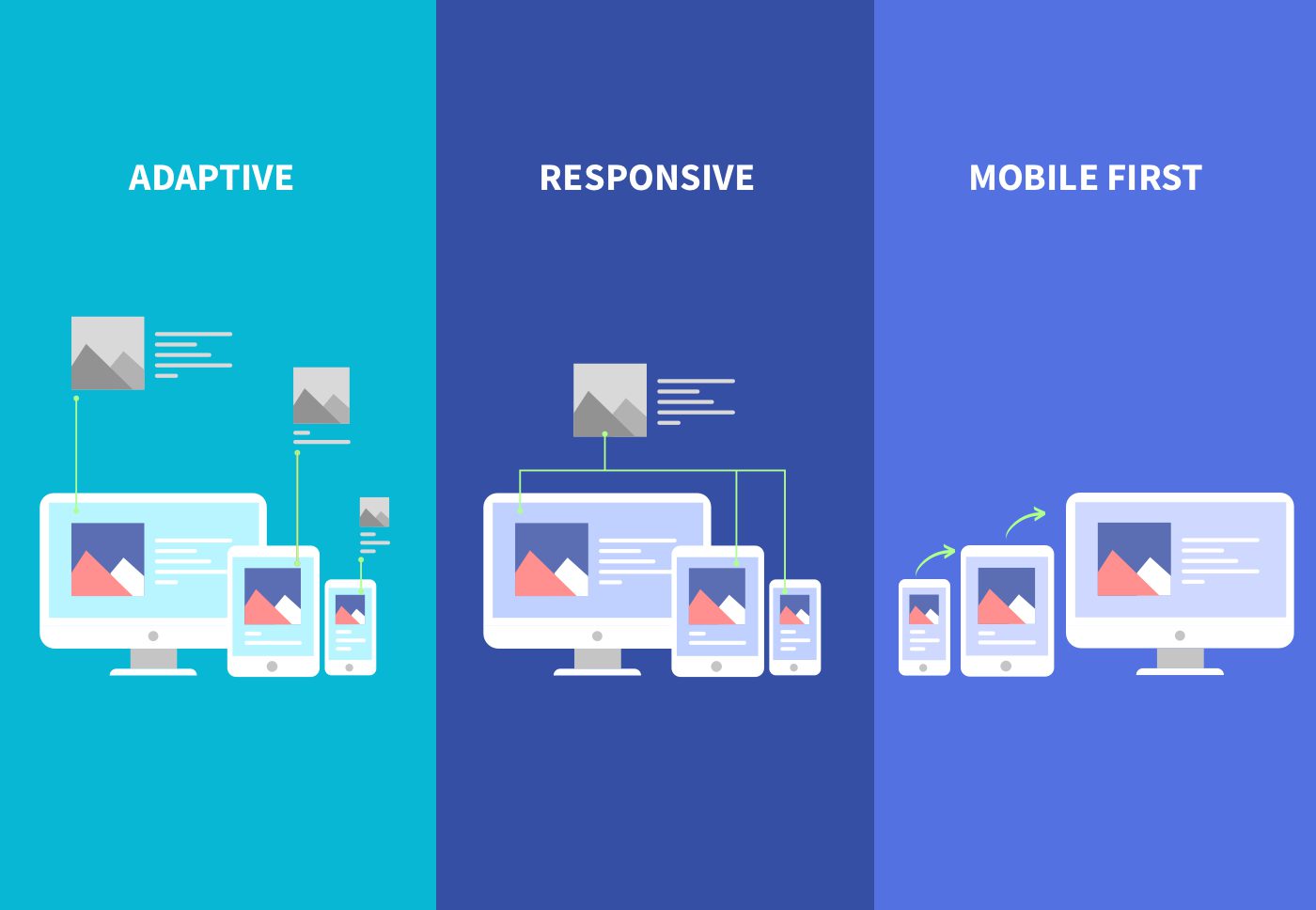
1. Responsive Design for Varied Devices: Skyweb Micro Solutions employs responsive design techniques that allow websites and applications to adapt seamlessly to various screen sizes. Whether accessed on a smartphone, tablet, or desktop, the user experience remains consistent, enhancing engagement across the board.
2. Faster Load Times for Instant Gratification: Mobile users, especially in the US, are accustomed to speed and instant access to information. Slow-loading websites can result in high bounce rates. Skyweb Micro Solutions optimizes websites for faster load times, ensuring users get the information they seek promptly, fostering a positive user experience.
3. Intuitive Navigation for Effortless Interactions: Navigating a website on a smaller screen requires a thoughtful approach. Skyweb Micro Solutions designs intuitive navigation structures that prioritize ease of use on mobile devices. This ensures that users can effortlessly explore and interact with the content, leading to increased engagement and longer session durations.
4. Visual Appeal for Lasting Impressions: In a visually-driven digital landscape, aesthetics play a crucial role in capturing and retaining user attention. Skyweb Micro Solutions crafts visually appealing designs that not only resonate with the brand but also create a memorable and positive impression, contributing to sustained user engagement.
Case Study 1: E-Commerce Evolution
Business Background: A prominent US-based e-commerce retailer faced challenges with high bounce rates and cart abandonment on their website. Recognizing the need to enhance the mobile shopping experience, they partnered with Skyweb Micro Solutions.
Mobile-First Design Implementation: Skyweb Micro Solutions revamped the website with a mobile-first approach. This involved optimizing product pages for smaller screens, implementing a simplified checkout process, and integrating responsive design elements to ensure a seamless experience across devices.
Results:
- User Engagement Soared: The bounce rate plummeted by 30%, indicating that users were more engaged and exploring the website thoroughly.
- Conversion Rates Skyrocketed: The optimized checkout process led to a remarkable 25% increase in conversion rates, translating into a substantial boost in sales.
- Positive Customer Feedback: Users praised the improved mobile experience, citing easier navigation and faster load times.
Case Study 2: Financial Services Transformation
Business Background: A financial services company in the US faced challenges in attracting and retaining users on their mobile app. Skyweb Micro Solutions was enlisted to enhance the app’s user interface and overall mobile experience.
Mobile-First Design Implementation: Skyweb Micro Solutions conducted a thorough analysis of user interactions within the app. They then implemented a mobile-first design strategy, simplifying navigation, optimizing forms for mobile input, and ensuring a consistent visual identity across platforms.
Results:
- User Retention Improved: The updated app experienced a 20% increase in user retention, indicating that users were finding value and satisfaction in the enhanced mobile experience.
- Increased App Ratings: Positive app reviews surged, reflecting users’ appreciation for the improved design and functionality.
- Higher Customer Engagement: Users were more likely to explore various features of the app, leading to increased engagement and utilization of financial services.
Case Study 3: Educational Platform Enhancement
Business Background: An e-learning platform catering to the US market faced challenges with user participation and course completion rates. Skyweb Micro Solutions was enlisted to make the platform more accessible and engaging.
Mobile-First Design Implementation: Recognizing the need for on-the-go learning, Skyweb Micro Solutions overhauled the platform with a mobile-first mindset. This involved creating responsive course layouts, implementing mobile-friendly quizzes, and introducing intuitive navigation for seamless learning experiences.
Results:
- Increased Course Completion Rates: Users on mobile devices were more likely to complete courses, leading to a 15% improvement in overall course completion rates.
- User Participation Surge: Mobile users actively participated in discussions and interactive elements, fostering a sense of community and collaboration.
- Positive Impact on Learning: Learners reported a more enjoyable and effective learning experience, attributing it to the improved mobile design.
While specific brand names remain confidential?, these success stories highlight the transformative power of strategic mobile-first web design and development Our commitment stays strong-consistently delivering design solutions that elevate user experiences, foster engagement, and drive digital success.
Conclusion:
As we conclude our exploration of the impact of mobile-first design on user engagement in the US market, it’s evident that this approach is not just a trend but a necessity. Skyweb Micro Solutions stands as a beacon of innovation in this space, We are a trusted partner in Web Development. Don’t let a slow website hold you back—partner with us today!